Vancouver Wellness Studio pressed refresh!
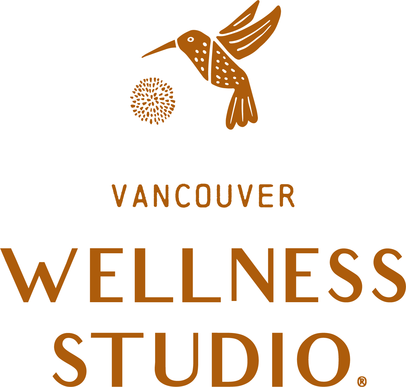
Meet our new brand logo…
With the soon-to-be expansion to the Vancouver Waterfront we felt that our original branding needed an expansion of its own!
This update very much represents the growth of VWS and our team.
Although we loved our old logo, it was self-made and had several focal points. Our team was ready for a change, and we wanted an evolution of our original logo that would be easier to recognize.
Our original logo was designed by our studio owner’s friend from college (who is amazingly talented by the way)! It was a passion project that evolved into this logo with the hummingbird, the flower and the circle representing collaboration.
We wanted to keep the hummingbird in our updated branding because the meaning behind it is still very true to us at VWS. As hummingbirds seem frantic and chaotic, flying about, they take time to stop and nourish themselves.
Our team of providers strive to teach our clients/patients the tools they need to pause during their busiest times, rest, and feel grounded in order to get well, and stay well.
Our new logo kept all of these important elements in an organic, yet abstract design - including the color! Orange is near and dear to our hearts and brings us joy on the daily!
Hopefully our new brand feels more cohesive and even easier to spot in the wild. It’s an evolution, and we hope you feel welcomed on the ride!
Over the next month you’ll see all of our digital marketing and social media branding shift over to these new logos. Our studio on Franklin will have a bit of a transition, so allow patience as the updates come about.
We are still Vancouver Wellness Studio, just refreshed.
Your VWS team.


